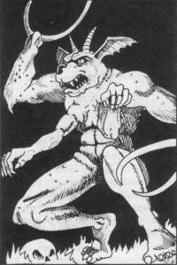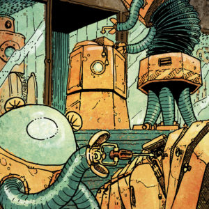
Let’s take a look under the hood … (Art by Luka Rejec)
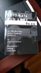
Last week I published my first RPG product, an OSR module entitled Automata Run Amok designed to be an introductory adventure for low-level characters. I’ve been pleased with the reception so far and, barring unforeseen circumstances, there will be a much more substantive follow-up publication next year. Before going to work on that new project, though, I thought it might be good to discuss explicitly some of the design choices that shaped Automata. This post is the first in a series to tackle that subject and it focuses on that topic of perennial debate at the heart of most modules: map keys.
Platonic vs. Aristotelian Map Keys
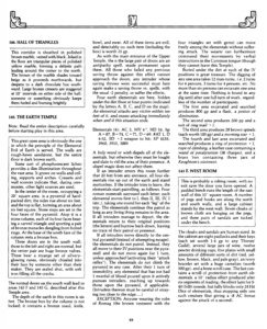
There seem to be two schools of thought on keying maps for published RPG adventures. In more traditional products, like many of those created in the early days of the hobby by TSR, map keys read like the authors were transcribing the platonic ideal of a play-through for that module: copious text lays out the details of each location with the assumption that every Dungeon Master aims for the same tone and style of information management, that the DM has carefully read and at committed much of the product to memory, and that the group consists of well-behaved players who will dutifully listen to and absorb those details before acting. Everything needed to run the location is present, somewhere in the text, but there’s very little indication that the writers concerned themselves with the realities of variable humans interacting with their creations in real-time. An example of this would be the key entry for the Earth Temple in The Temple of Elemental Evil:

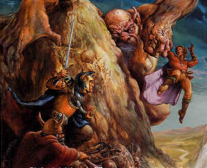
May Zuggtmoy help you if you need to know who and what is in the Earth Temple quickly while running ToEE …
The alternative to this ‘Platonic ideal’ approach is what I guess could playfully be described as Aristotelian — an empirical approach to map key information design based on observation and direct experience of what really happens at the gaming table. There have likely been examples of this throughout the history of the hobby, but the explosion of small publishers and other hobbyists dissecting and philosophizing about RPG design has intensified the drive to innovate the map key. Of course, like anything based on observation and direct experience, this innovation has led to a number of competing and idiosyncratic approaches. I will not even attempt to describe this variety except to say that, generally, these methods favor the hierarchical arrangement of information based on its perceived importance to play and the use of formatting to provide visual cues so DMs can quickly parse what is being presented. My work in Automata Run Amok borrows shamelessly from what I feel to be the best examples of this ‘Aristotelian’ map key design, distilling the practices and recommendations I have encountered over the last few years into what I hope is something solidly useful if not innovative.
Dissecting a Map Entry from Automata Run Amok
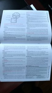
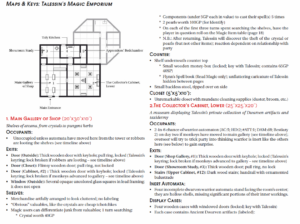
So, what does it mean in practical terms for my module to employ ‘Aristotelian’ map key design? That will be easier to explain by grounding the discussion in a specific example from the publication and then explicating how it embodies my design philosophy. Let’s look at the first entry in the key, which describes the public part of a tinkerer-wizard’s shop that has been overrun by out-of-control automata:

Some Aristotelian Key Entries (Click to Enlarge)
This makes an excellent example for three reasons: there is quite a lot of stuff for characters to investigate, its default state is rather static in terms of opposing NPCs and monsters, and it integrates some non-key elements of the module like its random tables and timeline. Even before diving into those details, though, notice how certain items are called out using color or styling (i.e., italics and bold-face) while the key entry largely consists sub-headings and bullet lists to create a clear hierarchy of information. Comparison with the entry for the second room shows that this layout is consistent so that, once the Dungeon Master learns the module’s visual vocabulary, he or she knows everything necessary to parse subsequent entries on-the-fly.
Now let’s walk through each element of the entry:
- Room number, name, and dimensions (larger red font): As the only non-black font in the module, the red titles for each entry clearly divide up the key’s entries instead of relying on spacing alone to convey this information. This allows the DM to find the entry’s beginning quickly and jump back-and-forth between the text and map without losing his or her place. The number’s purpose should be self-explanatory, while the name of the room simultaneously provides a shorthand indication of what kind of location is being described and makes sure there’s enough text for the red font to stand out. Finally, the dimensions are given in the top line since the player group’s mapper (remember, this is an OSR module!) will need this information. My habit when Dungeon Mastering is to give mappers the information they need early in the description unless there is a logical reason — such as a huge chamber or attacking monsters — that would prevent someone from quickly eyeballing the size of the room. That allows them time to sketch and revise even if the party is prone to moving along quickly from location to location.
- Brief evocative phrase (italic font): Quite a bit of the debate surrounding RPG map keys involves boxed text and I tend to agree with the argument that blocks of read-aloud for the DM are largely useless or even counter-productive at the table. It constrains the tone of the game to whatever the module author thinks is appropriate for a “typical” group and assumes a level of patience and attention to detail among players that I have rarely encountered in an individual let alone an entire party. However, ditching boxed text does limit the module author’s opportunities to convey the non-visual elements of a room that would be immediately evident — its smell, sounds, and general feel. My compromise is this evocative phrase, which describes the flavor of the room yet still allows the DM to couch that information in whatever tone or style fits their gaming group. For example, this particular room has “shelves of arcana and pungent herbs” — in other words, it’s a crowded shop of curios of mysterious origin suffused with the smells of magical ingredients. My opinion is that a DM doesn’t need more than this to describe the room in appropriate terms according to the needs and attention span of their player group.
- Subsection detailing room occupants (if any; bold-face header with bullet list of details): Once the DM has been given the top-level information about the room’s dimensions and feel, the module’s key consists of subsections presenting information in a hierarchical list from most to least important. Since the first thing players (and DMs) will want to know is whether a room contains living creatures to either speak with or kill, those are covered in the first subsection entitled “Occupants.” The shop room in the key above is typically unoccupied, but this subsection is still present because there is a chance of encountering monsters (monkey automata) or NPCs (robbers) as the adventure’s timeline, as outlined earlier in the module, advances. When appropriate, this description of the room’s occupants will also cover the likely reactions along with references to the module’s bestiary. A good example of this comes from the alchemy chamber later in the module:
Occupants:
• The first time the party enters the tower, a single monkey automaton (AC:6; HD:1+1; #ATT:2; DAM:d6; Bestiary 1) is in this chamber collecting the last two acid vials (the remainder are already piled on the catwalk near the ladder). Hearing the group enter, it will climb the wall and perch above the door – making a last few squeaks in the process
• When the first party member enters the room, the monkey will attempt a surprise attack and toss one of its acid vials (2d4HP direct damage; 1HP splash within 1’). Any counterattack will cause it to scamper over to the other side of the wall and toss another vial; a successful counterattack will cause it to leap onto the catwalk (which provides 25% cover from missile attacks)
- Subsection listing and describing exits (bold-face header with bullet list of details): Once the players know whether there’s anything in the room, the next thing they need to know is where the available exits are located and whether those exits are barred, locked, or otherwise impeded. This is also the next thing the party mapper will need to know once the outline of the room is sketched and therefore appears towards the beginning of the entry.
- Series of subsections listing items of interest (bold-face headers with bullet lists of details): The last thing a DM must provide players is a list of miscellaneous items within the room that can be interacted with or investigated. My intention here is that only the headers would be shared during the initial room description and that the additional information detailed in the bullet lists would only be disclosed if the party spends time (i.e., expends resources) to look more closely at the item in question. So, in our example, the DM would let the party know that there are shelves covered in items, a counter, and a closet in the shop. In most cases, I imagine, the party will be interested in seeing exactly what’s on the shelves and choose to spend a turn investigating those; at that point only they would learn that these contain objects “artfully arranged to look cluttered with no labeling,” including several large crystals (one of which is valuable), spell components if a magic user is doing the searching, and something special from the random magic item table. Similarly, if the party or member thereof spends a turn investigating the counter, they will find the shelf underneath with the book and money-box.
So that basically demonstrates my Aristotelian style of map keying, which leverages visual cues and the hierarchical presentation of information to make running the adventure at the table a smoother experience requiring less preparation. The page layout supports the structure of the key entries, with each two-page spread in the module containing all the entries relevant to the map (an innovation lifted from Maze of the Blue Medusa) and trackers with check-boxes and blanks for the DM to note the passage of time, defeat of enemies, and other changes to the location (suggested by my editor and illustrator, Luka Rejec). When printed out, all of this information would be visible at once and (hopefully) easy to interpret even with the reality of excited players, imperfect recall of module details, and a tone that in my experience inevitably oscillates between epic and farce.
Quick Summary of Map Keying Practices
- Consistent ‘visual vocabulary’ across all map key entries
- Hierarchical presentation of information (from possible threats to miscellaneous objects to investigate)
- Front-loading of information for mapper (dimensions and exits)
- Use of ‘evocative phrase’ as substitute for boxed text to convey non-visual information not specifically associated with items in the room (i.e., the ‘flavor’ of the location)
- Subsections for each item in the room with which players can interact; bullet list details only shared with players if they expend resources (time, light source, random encounter rolls, etc.)
- All key entries appear on same two-page spread as map that references them along with visual tracking tools to keep track of monsters defeated and similar things
[If any of this sounds interesting, please pick up a PWYW copy of Automata Run Amok at DrivethruRPG; if you have any feedback — including reviews — please let me know!]
 Last week was the first session of my Wednesday night Roll20/Discord group’s new B/X campaign (a continuation of a long-running AD&D campaign that went on hiatus last year). Overall, I think it was a successful revival of the game with both the players and myself quickly falling back into both our roles and the lore of the setting.


